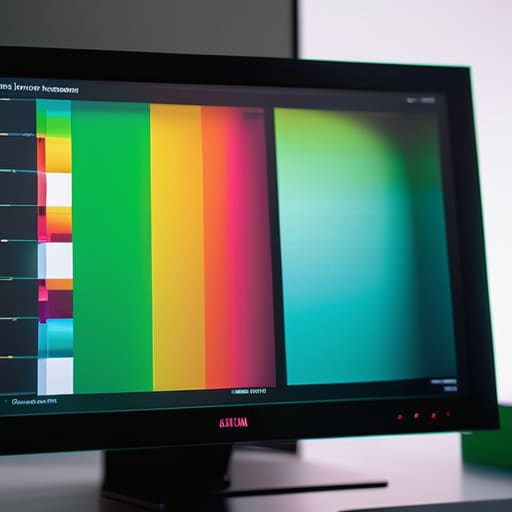

I remember sitting in my old physics lab, staring at two different monitors side-by-side, feeling that familiar, nagging itch of frustration. One showed a sunset that looked like a bruised peach, while the other boasted colors so vivid they felt almost aggressive. Salespeople will throw around acronyms like sRGB or DCI-P3 as if they are magic spells, but they rarely stop to explain what colour gamut means in terms of actual, physical limitations. They sell you the possibility of color, but they never talk about the actual boundaries of the container. To me, a specification sheet is just a polite way of hiding the fact that your screen is physically incapable of seeing certain parts of the light spectrum.
I am not here to recite a textbook or sell you a high-end calibrated display. Instead, I want to look at the mechanics of the light itself. I’m going to strip away the marketing gloss and show you how these color spaces function as mathematical fences, limiting what your hardware can actually do when the power is on. By the time we are done, you won’t just know the definition; you will understand the physical constraints of the light hitting your eyes.
The Chromaticity Diagram Basics Mapping the Invisible
When I opened up my old oscilloscope back in the nineties, I was obsessed with seeing the actual wave, not just the readout on the screen. Mapping color is much the same. To understand how we define these boundaries, we use the chromaticity diagram—that strange, horseshoe-shaped rainbow you see in textbooks. Think of it as a topographical map of light. It doesn’t tell you how bright a color is, but it defines the absolute limits of what the human eye can perceive. Everything inside that curved boundary is a color we can actually see; everything outside is just a mathematical ghost.
When I’m looking at different monitor color accuracy standards, I’m essentially checking how much of that “map” a device can actually cover. This is where the distinction between color space vs color gamut becomes vital. A color space is the mathematical language used to describe a color, while the gamut is the actual physical territory a device can reach. If your screen’s gamut is small, it’s like trying to paint a landscape using only a tiny, limited set of watercolors; you might get the gist of the scene, but you’ll never capture the true, piercing brilliance of a summer sky.
Display Color Reproduction and the Illusion of Truth

I spent last Tuesday with a screwdriver and a magnifying loupe, peering into the guts of my old desktop monitor. Seeing the liquid crystal layer and the backlight assembly laid out like a tiny, glowing city reminded me that every screen is, essentially, a liar. We call it display color reproduction, but that’s a polite way of saying the machine is performing a highly choreographed trick. It isn’t showing you light; it is showing you a mathematical approximation of light, constrained by the physical limits of the phosphors or LEDs inside.
This is where the frustration of gamut mapping explained becomes real for anyone who has ever looked at a printed photograph and thought, “That’s not what I saw on my screen.” When a device tries to display a color that exists in nature but sits outside its physical capabilities, it has to make a choice. It can’t reach that vibrant, electric teal, so it “maps” it to the closest possible neighbor it can actually produce. It’s a compromise. Whether you are comparing Adobe RGB vs sRGB, you are really just deciding which set of compromises you are willing to live with to maintain the illusion of truth.
A Physicist's Guide to Not Getting Fooled by Pretty Pictures
- Don’t mistake “brightness” for “gamut.” I once opened up an old cathode-ray tube monitor only to realize that while it could throw a lot of light at your eyes, its ability to actually distinguish between a deep crimson and a burnt orange was practically non-existent. A bright screen with a narrow gamut is just a very loud, very dull megaphone.
- Look for the standard, not the marketing fluff. When you’re looking at a new device, ignore the adjectives and look for the acronyms like sRGB or DCI-P3. It’s like checking the escapement in a clock; the acronym tells you exactly how much “swing” the color range actually has before it hits the physical limits of the hardware.
- Understand that your eyes are the final, uncalibrated sensor in the circuit. Even if a screen has a massive gamut, if the white balance is skewed, your brain will compensate and “correct” the colors incorrectly. I’ve spent hours cleaning tiny gears in a timepiece only to realize the lighting in my workshop was lying to me about the metal’s hue.
- Match the gamut to the task at hand. If you are just scrolling through news articles, a wide gamut is overkill and can actually make text look strangely colored. It’s like using a high-precision micrometre to measure a piece of lumber; it’s the wrong tool for the job and usually just adds unnecessary complexity.
- Always remember that gamut is a boundary, not a guarantee. A manufacturer can claim a device covers 99% of a color space, but that doesn’t tell you how the device handles the transitions between those colors. I want to see how the “gears” mesh—how smoothly it moves from a pale peach to a deep coral without stepping or jumping.
What to Carry With You
Think of gamut not as a list of colors, but as the physical boundaries of a container; if a device has a small gamut, it simply lacks the “room” to hold the most intense versions of a color.
A screen never shows you reality; it shows you a mathematical approximation of it, constrained by the specific chemical or electronic limits of its own hardware.
When you are looking at a beautiful sunset on a display, remember that the most vibrant part of that light is likely being “clipped” or ignored because the device’s gamut isn’t wide enough to catch it.
The Limits of the Lens
When I look at a screen, I no longer see just a pretty picture; I see the invisible boundaries of a mathematical cage. We have traced how the chromaticity diagram acts as our map, and how every display—no matter how expensive—is essentially a device trying to mimic a much larger, more chaotic reality within a very specific set of coordinates. Whether it is an sRGB monitor or a wide-gamut professional display, what we are really discussing is the size of the bucket. If the colors of a sunset aren’t in that bucket, the device simply cannot hold them, no matter how many pixels you throw at the problem. Understanding gamut means accepting that every digital image is a compromise between the infinite spectrum of light and the physical limitations of the hardware.
I spent years teaching my students that physics isn’t about memorizing formulas, but about understanding the constraints of the universe. Color gamut is much the same. It is the realization that our tools are always reaching for something just out of grasp. But there is a certain beauty in that pursuit. Once you recognize the edges of the frame, you start to appreciate the intentionality of the light that actually makes it through. Don’t just look at the colors; look for the edges where they stop. That is where the true mechanics of your world begin to reveal themselves.
Frequently Asked Questions
If I upgrade to a more expensive monitor with a wider gamut, will my old photos actually look better, or am I just seeing a different version of the same lie?
It depends on whether your old photos were “born” with that extra color. If you’re looking at a standard sRGB file, a wider gamut monitor won’t magically conjure new reds; it will just show you the same limited palette more accurately. However, if your files were captured in a high-bit depth format, the new monitor stops being a filter and starts being a window. You aren’t seeing a better lie; you’re finally seeing the truth.
Why do some professional cameras capture colors that my home printer simply refuses to acknowledge exist?
It comes down to the physical limits of the ink. When I opened up my old inkjet, I saw the tiny nozzles fighting to mix cyan, magenta, yellow, and black. That combination creates a specific “gamut”—a finite territory of color. A professional camera sensor captures a massive, sprawling landscape of light, but your printer is trying to squeeze that vast valley into a small, handheld box. If the color isn’t in the printer’s bucket, it simply can’t exist on paper.
Does a wider color gamut actually make an image look more "real," or is it just another way for manufacturers to make the light work harder to trick my eyes?
It’s a bit of both, really. When I opened up that old monitor last week, I saw how much energy goes into just pushing those specific wavelengths. A wider gamut isn’t “faking” reality; it’s simply expanding the vocabulary of light available to the machine. If the “bucket” of colors is too small, the machine has to smudge a bright crimson into a dull orange just to make it fit. A wider gamut just lets the light be more honest.