
Last Tuesday, I sat at my workbench with a 1950s Westclox alarm clock, trying to figure out why the escapement was sticking. It’s the same frustration I feel when I open a piece of software that feels like it was designed by a committee of people who have never actually used a tool in their lives. We’ve been conditioned to believe that if an interface is cluttered or a workflow is nonsensical, we just need to “learn the system.” That is nonsense. Most people don’t want a digital labyrinth; they want a lever that works. If you are currently staring at a screen, wondering how to find alternatives to an app you dislike without falling into a trap of even worse, bloatware-filled substitutes, you aren’t being difficult—you are being rational.
I am not here to give you a list of “top-rated” tools pulled from a marketing brochure. Instead, I want to teach you how to perform a functional autopsy on your digital tools. We are going to strip away the flashy animations and the subscription models to see what is actually driving the gears. My promise is simple: I will show you how to identify the core mechanism of what you need so you can find a replacement that actually serves your habits, rather than forcing you to serve its whims.
Beyond the Hype Using Software Comparison Tools
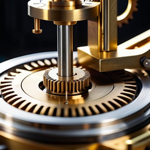
When I’m working on a vintage pendulum clock, I don’t just guess which gear is slipping; I measure the teeth. We should treat software with the same scrutiny. It is tempting to trust a flashy marketing landing page, but those are just the polished brass casings. To see the actual movement, you need to look at software comparison tools that strip away the adjectives. I’ve learned that a side-by-side app feature parity check is the only way to ensure you aren’t trading one headache for another. If the new tool lacks the one specific toggle that keeps your data organized, the entire mechanism fails you.
However, don’t let a high score fool you. I’ve seen plenty of “top-rated” devices that look beautiful but lack structural integrity. I always dig into the user reviews and ratings, specifically looking for the complaints about the “small stuff”—the laggy menus or the unintuitive buttons. A tool might have a thousand stars, but if the community is constantly complaining about a broken workflow, that’s a sign of a poorly designed internal escapement. You aren’t just buying a brand; you are buying a way of working.
The Truth in the Margins User Reviews and Ratings

When I sat at my workbench last Tuesday, I spent three hours cleaning the escapement of a 19th-century carriage clock. It taught me something useful about reading user reviews and ratings: you have to look past the polished brass. Most people will leave a review because they are angry that a button moved or they are delighted that a color changed. That isn’t data; that’s just noise. To find a real replacement, you must ignore the emotional outbursts and hunt for the mechanical failures. Look for the people complaining about latency, sync errors, or how a tool behaves when the internet drops out. That is where the true guts of the software are revealed.
I also find that people rarely mention the most important part: the friction of switching software workflows. A new app might have more bells and whistles, but if it requires you to rewire your entire mental process just to perform a basic task, it’s a poorly designed machine. I always look for reviews that mention how a tool handles a specific, repetitive action. If the reviewers can’t agree on how the tool behaves when they aren’t actively tinkering with it, it’s probably not worth your time.
The Disassembly Method: Five Ways to Strip an App Down to Its Gears
- Identify the single broken gear. Before you go hunting, I need you to stop looking at the whole interface and find the one specific mechanism that is failing you. Is it the way it handles data, or is it just a poorly placed button? If you don’t know which part is jammed, you’ll end up buying a whole new machine that has the exact same flaw.
- Follow the data trail. An app is just a series of pipes for your information. When I look for a replacement, I don’t look at the colors; I look at where the information goes when I click ‘save.’ Look for alternatives that use the same logic for your data flow, otherwise, you’ll spend more time rebuilding your habits than actually using the tool.
- Test the “Idle State.” I always ask myself what a device does when it isn’t being actively manipulated. For an app, this means checking its background processes. Does the alternative drain your battery or ping your server constantly when you aren’t even looking at it? If it’s noisy when it should be silent, it’s a poorly designed engine.
- Ignore the “Feature Bloat” shine. Manufacturers love to add extra levers and dials to make a tool look more complex and valuable. I’ve spent many afternoons cleaning out unnecessary parts from old clocks. When looking at alternatives, ignore the “extra” features listed in the marketing. Look for the one that performs the core function with the fewest moving parts.
- The “Muscle Memory” Audit. A good tool should eventually feel like an extension of your hand, much like a well-oiled screwdriver. When you trial a new app, don’t just see if it works—see if it fights your natural rhythm. If you have to stop and think about where the “undo” function lives every single time, the mechanism is poorly calibrated for your use.
The Inspector’s Checklist for New Software
Don’t let a sleek interface fool you; if you can’t map the new app’s specific functions to your daily habits within five minutes, it’s just more digital clutter.
Treat user reviews like a worn-out gear in a clock—ignore the shiny exterior and look for the repetitive friction points that tell you where the mechanism actually fails.
A true replacement isn’t just a different brand of the same tool; it must solve the specific mechanical frustration that made you want to discard the old one in the first place.
The Final Inspection

Finding a replacement isn’t about chasing the newest shiny object or the one with the most colorful marketing. It’s about the mechanics of your own workflow. We’ve looked at how to strip away the marketing veneer using comparison tools and how to peer into the actual gears of a program by reading the unfiltered truth in user reviews. You have to look past the interface and ask: does this tool actually solve the problem when I’m not actively staring at it? If you can’t match the specific function of your old software to a new one with absolute precision, you aren’t finding an alternative; you’re just buying a different kind of frustration.
In my workshop, if a clock’s escapement is faulty, no amount of polishing the brass will make it keep time. Software is much the same. Don’t settle for an application that looks beautiful but lacks the internal logic to support your habits. Treat your digital toolkit like a well-maintained machine: every part must have a purpose, and every gear must mesh perfectly with the next. Once you learn to dismantle the hype and see the underlying utility, you stop being a passenger to your technology and start being its master. Now, go find the tool that actually works.
Frequently Asked Questions
How do I know if a "better" app is actually simpler, or if it's just hiding its complexity behind a prettier interface?
The “Pretty Interface Trap” is real. I learned this with old analog watches; a polished brass casing doesn’t mean the escapement isn’t a mess. To test a new app, ignore the colors and the smooth transitions. Try to perform your most repetitive, boring task immediately. If you find yourself hunting through nested menus or “hidden” gestures just to find a basic setting, the complexity hasn’t vanished—it’s just been painted over.
When I'm looking at reviews, how can I tell the difference between a genuine technical critique and someone just being grumpy because they forgot their password?
Look for the mechanics. A genuine critique identifies a specific gear that isn’t turning—they’ll mention a lag during export or a menu that disappears when you click “save.” That’s a structural flaw. If the review is just a scream into the void about “bad service” or “it doesn’t work,” they haven’t encountered a broken mechanism; they’ve just encountered a closed door. If they can’t name the part that failed, it isn’t a technical problem.
If an alternative app has all the features I need but lacks the one specific "habit" I've built around my current one, is it actually a functional replacement?
No, it isn’t. If you have to fight your own muscle memory every time you open the app, the mechanism is broken. I look at it like a clock escapement; if the teeth don’t mesh with the wheel, the whole thing just ticks aimlessly without actually keeping time. A tool that forces you to rewrite your daily rhythm isn’t a solution—it’s just another piece of friction you’ll eventually want to dismantle.